Crew
-
Recent Posts
Category Archives: Typography
1
Posted in Typography
Bastei Restart
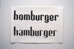
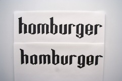
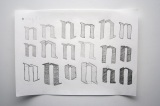
After not getting anywhere with my first couple of tries and constantly being critiqued by my teacher for approaching this thing the wrong way, I decided to start over. This time actually sketching first. Et voila, the first (second) ones – not much, I know – but hey, Peter gave me more feedback on those than on all my other stuff before that.
Bastei Font III
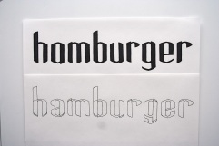
Continuing. Teacher didn’t say much. I should try more combinations of round and edgy, look at the old classic Blackletter Fonts. And create more individual letters instead of ‘series’.
ISTD finished
It’s done. Thanks for your comments and critics.
This was actually the only project at university I enjoyed. Due to my own lazyness it could have been better but its still not to bad. I am happy 😀 Never slept less the last days.
Happy Days!!!
Bastei Font II
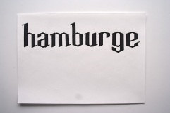
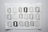
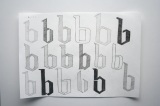
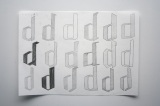
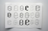
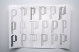
An update on the Font Design. After some talks with my teacher, we decided it’s best I start from scratch again as I hadn’t really sketched different designs in the beginning but just ‘drawn’ a more or less final style of letters. So here we go: the letters I was supposed to start out with – a, b, d, e, n, p. Tried out different things, not sure yet which direction exactly it’s going to be headin’. I’ve circled my favorites with a light pencil line, hope you can see it.
ISTD VII
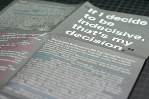
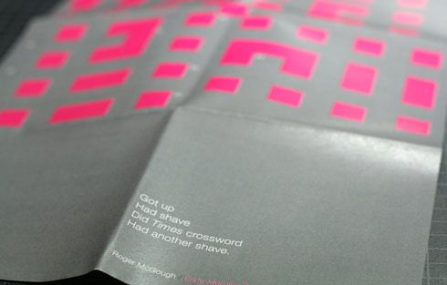
the poem poster… what do you say? i also changed the back of the cover. the quote: now left justfied and one point bigger than before. i also changed the last line. who needs display needs… esche you were right. it’s much nicer now. i tried that solution before but i just thought its not enough information for the customer…pfff. esche i’m still working on the inner envelopes. its really hard to find a satisfying solution.
ISTD VI
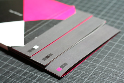
i’m frustrated. i wanted to print tomorrow and time is running. my teacher likes the cover but he asked for the link and i think there is a link but not a really strong one. also sebastian asked if i couldnt do the inner envelope a bit more elegant which is true and i knew. now that it came from somebody else, i cant live with it anymore. so i’m working on it again. if you could tell me if you like those squares in the background would be great. i cant say it at the moment. i actually do really like them but i also thought they are far to big and may be look to import. to be or not to be? yes or no?
the discussion is reopened anyway so if you could give me some feedback for the back would be also nice. tried quite a lot stuff. is not really a nice thing to do. hate backside!
ISTD V
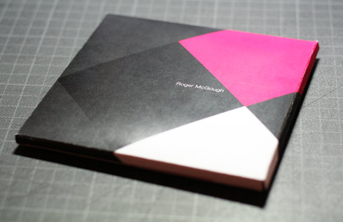
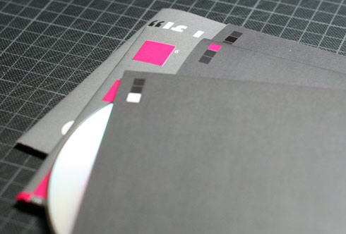
Thats it. My three-piece suit. Here again the quote thats motivated me for that kind of appearance:
“I have pictured the creative process as something like two parts of the brain at work on a poem: Magenta, who is often skimpily dressed, comes up with all the wild ideas; and Max, who wears a three-piece suit, is in charge of qualitiy control.”
Still just a dummy and some little things, i just recognized, that should be changed. Also the paper is just a standard one. I’ve been to a print shop today. (I hate those fuckin leaflet-I-know-how-the-world-works-printerguys.) …finally just normal paper. Happy days. But 7 seven days to go and still hell a lot to do. cheerio guys!!!


